Project information
- GitHub URL: Learn at Home
- create date: Feb. 2, 2023
- evaluation date: Feb. 23, 2023
- Skills:
UML (Unified Modelling Language)
Wireframe
User Story
Introduction
This project was about designing an online platform to connect students with tutors, providing structured learning support in a digital environment. This project required extensive upfront planning and design work to ensure that the platform would be intuitive, efficient, and meet the needs of both students and tutors. Using a combination of tools like Figma, Notion, and established design methodologies, I created a comprehensive blueprint for the website, laying a strong foundation for its development.
Project Highlights:
-
- UML Diagram with Figma: Created a detailed UML to visualize the system’s architecture, including Student, Tutor, and Session models.
- User Stories: Developed comprehensive user stories to define platform requirements and prioritize features from a user-centric perspective.
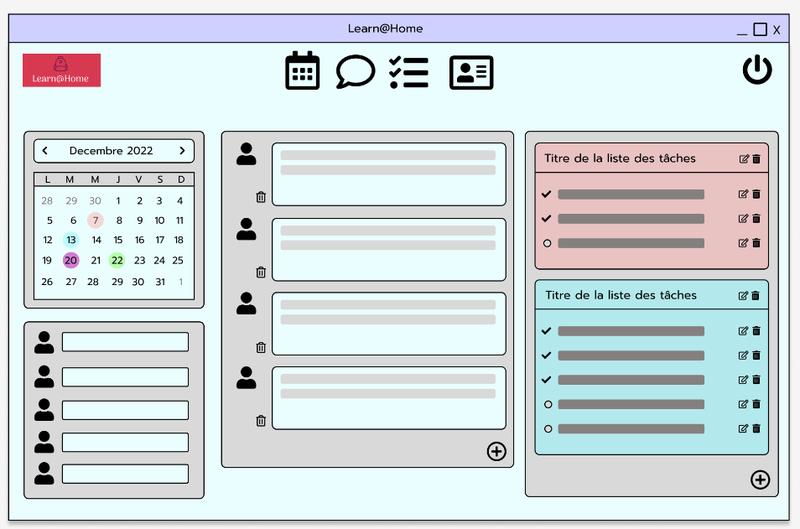
- Wireframes: Designed wireframes to plan the visual layout and ensure a logical user flow through the platform’s pages.
- Kanban Board with Notion: Used Notion for organizing tasks and managing the project’s development lifecycle, tracking progress from inception to completion.
This project exemplifies the importance of structured planning and design in the development of a complex web platform. By leveraging a variety of design and project management tools, I was able to create a clear blueprint that guided the development process, ensuring a cohesive and well-thought-out product that meets the needs of both students and tutors.
Competences
-
- create an Unified Modelling Language (UML) with Figma
- create a User Story
- create a WireFrame
- using Notion as a Kanban tool
Learning Experience
1. Unified Modeling Language (UML) Design with Figma
I started the project by designing a UML diagram in Figma to visually represent the architecture and interactions between the various components of the platform. The diagram included classes for Students, Tutors, Sessions, and Subjects, as well as the relationships between them, such as one-to-many (one tutor can have multiple students) and many-to-many connections (students can be associated with multiple subjects). This diagram served as a roadmap for the backend development, ensuring that the database schema and business logic were aligned with the platform’s goals.
Core Components of the UML:
-
-
- Student and Tutor Models: Represented with attributes like name, age, subjects, and contact information.
- Session and Booking Models: Detailed the interactions between students and tutors, scheduling sessions, and tracking progress.
- Relationships: Established clear one-to-many and many-to-many relationships, showing how tutors and students interact through session bookings.
-
The UML diagram provided a bird’s-eye view of the entire system, allowing stakeholders and developers to understand the data flow and structure of the application.
2. User Story Creation for Clear Requirement Definition
To capture the functional requirements of the platform, I wrote detailed User Stories for both students and tutors. Each user story was written from the perspective of the end user, defining what they would like to accomplish on the platform. These stories helped identify the key features needed for an intuitive user experience and set clear priorities for the development process.
Example User Stories:
-
- As a student, I want to browse through a list of available tutors, so that I can find a tutor who specializes in the subjects I need help with.
- As a tutor, I want to manage my availability, so that I can easily schedule sessions with students.
These user stories guided the feature development, ensuring that the platform met the expectations of its users and provided the necessary functionalities for an effective learning support system.
3. Wireframe Design for Visual Layout and Navigation
Using Wireframes, I sketched out the visual layout of the website, mapping the flow between pages and defining the placement of core elements like search bars, tutor profiles, and booking options. The wireframes were created to represent the interface from both the student’s and tutor’s perspectives, including key pages such as:
-
- Home Page: Introduces the platform, highlights key features, and provides a starting point for browsing tutors.
- Tutor Search Page: Allows students to filter and search through tutor profiles based on subject expertise, availability, and ratings.
- Session Booking Page: Facilitates easy scheduling of tutoring sessions and provides options to view session history.
- Tutor Dashboard: Displays a personalized dashboard for tutors, showing their upcoming sessions, student list, and feedback.
By visualizing the structure early on, the wireframes served as a guide for both UI and UX design, ensuring a logical navigation flow and a user-friendly interface.
4. Task Management and Organization with Notion
To streamline the project management process, I used Notion as a Kanban tool for organizing tasks and tracking progress. The Kanban board was set up to categorize tasks into columns such as Backlog, In Progress, and Completed, making it easy to visualize the development pipeline. Each task card contained specific details, such as descriptions, due dates, and dependencies, ensuring that all team members were aligned and aware of the project’s status.
Key Features of the Notion Board:
-
- Task Prioritization: High-priority tasks like wireframe creation and core functionality development were highlighted to keep the project on track.
- Sub-Tasks and Dependencies: Complex tasks were broken down into manageable sub-tasks, with dependencies defined to ensure a logical order of completion.
- Collaborative Updates: Team members could leave comments, mark task status, and attach relevant documents, providing a collaborative environment for project tracking.
This approach facilitated smooth project management and allowed for efficient collaboration and communication across the team.
